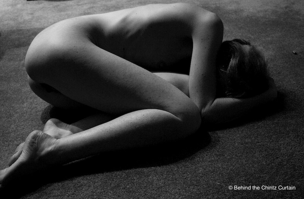
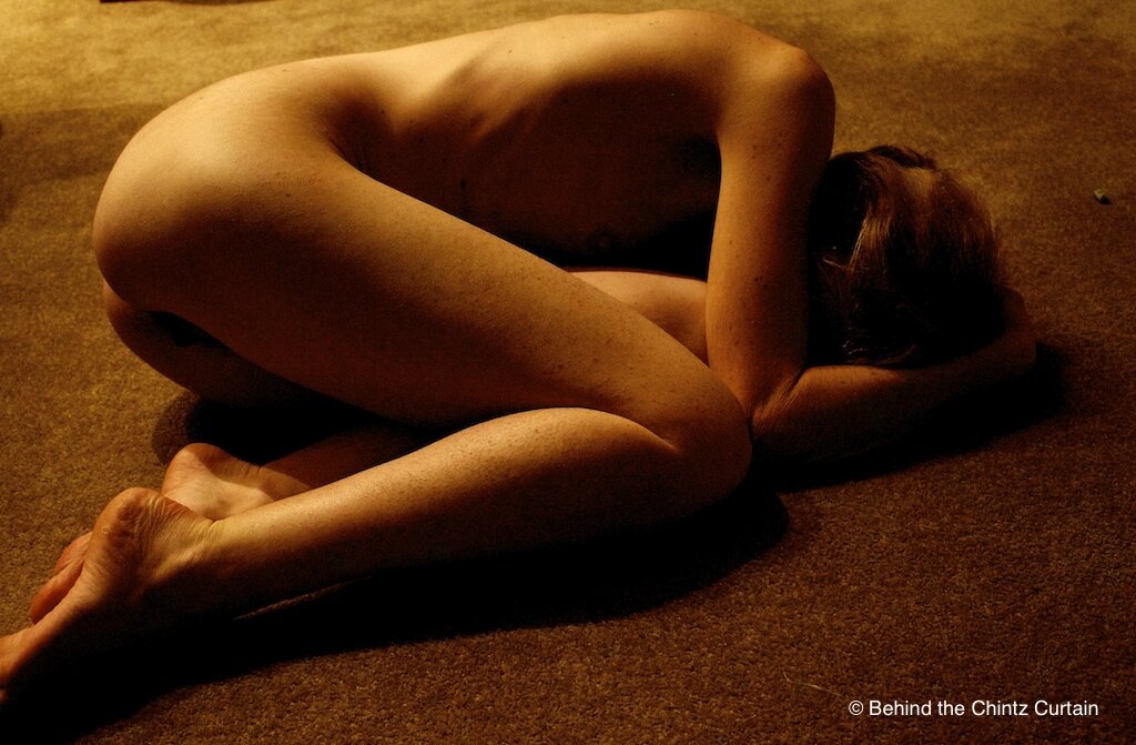
This month’s Sinful Sunday prompt is ‘Black and White’:
“Not to be confused with monochrome which means ‘one colour’. I am looking for purely black and white images. No Sepia, no Cyanotype, no Split Tones, no Infrared etc just plain ole Black and White.
However, in order to add interest I am going to suggest that it would be fun if we all posted the original colour version of the image alongside the Black and White so we can see how the two compare.”
Ever since I took my triptych images for the last Sinful Sunday competition, I have become more and more interested in how I light my photographs. The below picture was lit almost entirely by the glow of a fire (hence the post title) with a little stray light coming through the doorway of an adjoining room.
I’m actually not sure whether I like the black and white or the colour version, with its very orangey tones, as the two variations give me completely different feelings. Which do you guys prefer?
Oh, and ten points if you can spot the stray piece of LEGO I forgot to pick up off the floor before shooting this! ![]()


You look so beautiful. The vulnerability of your position portrays such safety to me. The colour and b&w versions are do different in mood.
I like the black and white one more. The composition of the image is wonderful. You look vulnerable, beautiful and like your either waiting for something/someone, or something has just happened.
I can confirm on the ‘just happened’.
Like you, I get a different feeling from the two photos – I do not have a favorite, I like them both
Rebel xox
I like both of them for different reasons. The first is atmospheric and almost tinged with a sadness or unknown pain – the second is warm and has a more snuggly feeling!
The moods definitely change. I like the B&W one better though for the image it portrays.
~Kazi xxx
Lol!!! . . . the “just happened” confirmation. I’m sure that piece of lego was the last thing from your mind (unless you’d encountered it during the lead-up to the “just happened”).
Both are lovely . . . and very personal. Beautiful!!!
Xxx – K
Like Cara I like them both for different reasons, in the colour image we can see more of your breast and there is a tantalizing glimpse between your legs. It has a warmth and softness to it that makes you appear almost cat like, curled up and relaxed.
The black and white is very different, it feels more gritty and raw and seems to emphasis a story of isolation and vulnerability. However I think I prefer this one, I like the way the edit has created a beautiful light along your back, hip and shoulder pulling the eye into that contour of your body and encouraging the viewer to visual glide back and forth across that part of your body
Mollyxxx
There’s so much beauty in the vulnerability portrayed here. I like the warm snuggly feel of the colour image though.
I like both for the different reasons highlighted by others above, for me the black and white has a lovely raw feeling that just draws me in.
~Mia~ xx
Found the Lego!!!! lol
I prefer the first photo. I agree with you, that the second photo seems a bit “orangy” it’s still a great photo. Just think the first one is more powerful.
beautiful
I know Lego gets everywhere – and it’s normally found in the middle of night, barefoot and causes new AngloSaxon words to be discovered!
Oh, and awesome photographs. Like Molly, I like both for different reasons, but the monochrome is striking!
As others have mentioned, I like both images & think they have very different feels…I have a slight preference for the black and white version though; the intensity is beautiful!
xxPenny
One can feel all kinds of different emotions as we can not be sure if she is vulnerable and needs help, or if she is simply resigned and trusting
They are both lovely. I love the vulnerability of the black and white, though.
Both are beautiful images. I love that you’ve used the fire for lighting, gives the bottom a very warm feeling yet the foetal position suggests you are scared. The black and white has a very eerie eel to it xxx